A simple walkthrough to use the Engauge Digitizer to pull values off a "printed" graph
There's a far more complete manual that comes with the download, but these are the steps I used to generate the data for the webservices graphs. It assumes you've got a black and white image of the graph, with continuous lines for the data and orthogonal gridlines, and linear axes.
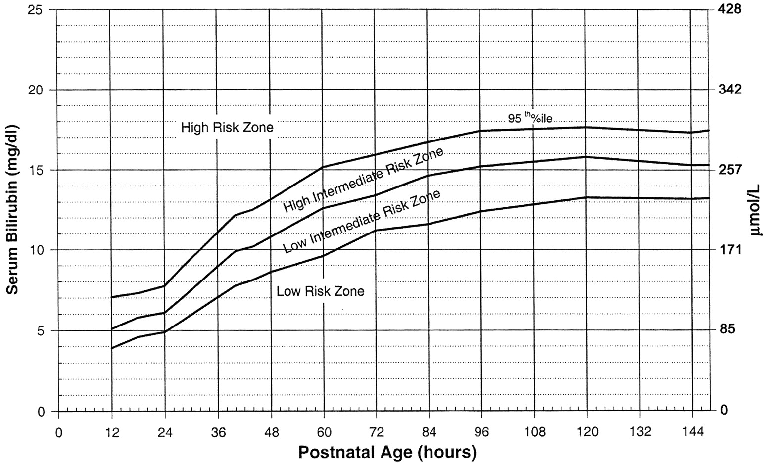
We'll use the bilirubin risk levels from the AAP bilirubin guidelines:
Open the digitizer
You can't use
Open with...from the context menu because the program expects filenames as part of the options; you can read the manual to see how to modify the context menu. ClickImporton the toolbar: and select your image file:
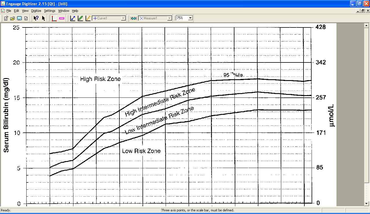
Save your work (it's a
.digfile) often. You don't need me to remind you.Set the axes
Click
Axis Pointin the toolbar: and click on the origin
(lower left corner) of the graph and enter the x,y values for the origin in the units of the graph (not pixels!). Usually that's (0,0)
but can be anything. Click on the maximum of the y-axis (upper left corner), then the maximum of the x-axis (lower right corner).
and click on the origin
(lower left corner) of the graph and enter the x,y values for the origin in the units of the graph (not pixels!). Usually that's (0,0)
but can be anything. Click on the maximum of the y-axis (upper left corner), then the maximum of the x-axis (lower right corner).Remove the grid
Select
Grid Removal...from theSettingsmenu. Select "Remove thin lines parallel to the axes" and play with the "Minimum line thickness" until the gridlines are gone from the preview on the bottom but the real curves are still there.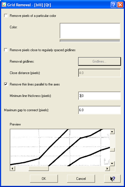
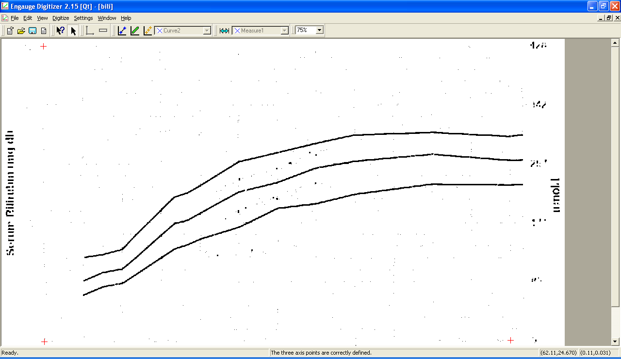
Now the grid is gone and digitizing the curves will be easy:
Create curves
Select
Curves...from theSettingsmenu. Create as many curves as you need (we have three). Give them descriptive names if you like: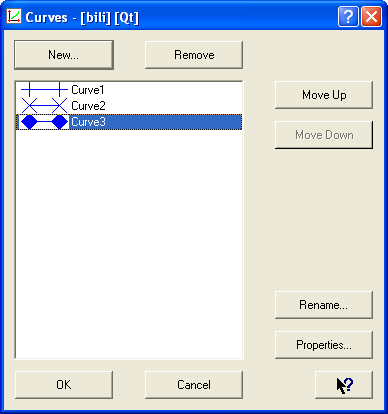
Digitize each curve
Click
Segment Fillin the toolbar: . For each curve, select it
from the curve menu:
. For each curve, select it
from the curve menu:  and click the points on the graph for that curve until
it is covered with points. There's no undo command. If a wrong point is included, use the
and click the points on the graph for that curve until
it is covered with points. There's no undo command. If a wrong point is included, use the Selecttool: to select the bad points and use the
 Deletekey. To add individual points, use theCurve Pointtool: . In a few clicks, you have the fully
digitized graph:
. In a few clicks, you have the fully
digitized graph: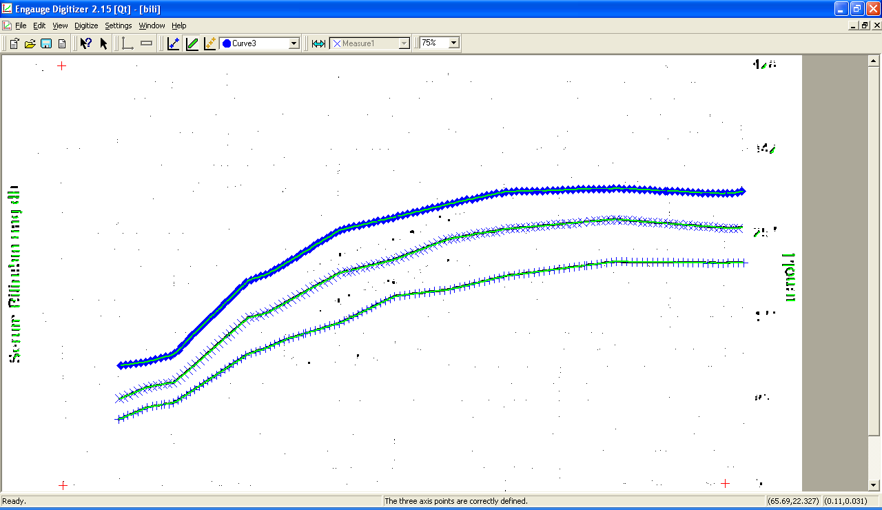
Set up the export
If you exported the data now, you'd have lots of points; probably far more than is justified from the original graph. Decide which x-axis values should be exported (the program will interpolate appropriately if the digitized points don't land exactly). Select
Grid Display...from theSettingsmenu: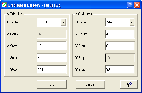
The values to be specified are related by
count = (stop - start)/stepso you only need to specify three; select the one you don't want to specify from theDisabledropdown menu. Make sure that the start and stop values are actually in the curve; the program will happily extrapolate off the curve but it's probably not scientifically legitimate. Ignore the y axis grid lines.Select
Export Setup...from theSettingsmenu. In thePoints Selectionsection, selectIntepolate Y's at gridline X's.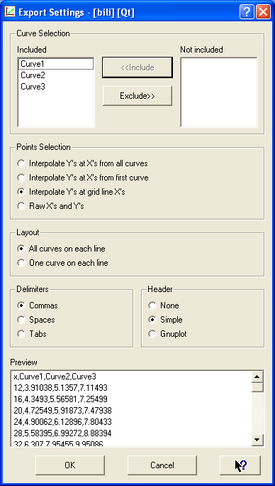
Export
Click the
Exporticon in the toolbar: . Pick a name and you now have a
CSV file with your data. Simple, no?
. Pick a name and you now have a
CSV file with your data. Simple, no?

Frank Doyle says:
Have you attempted to print the graph that results from / during the Engauge 4.1 analysis?
I cannot “rescale” the internal image to obtain a plot that will fit on printer paper. I only get an enlarged image of the top left corner area.
January 23, 2010, 3:11 pmDanny says:
@Frank Doyle:
January 25, 2010, 10:15 pmNo, I’ve never tried to print from Engauge. I took screenshots, which isn’t quite the same thing but worked for my examples. I’ve always exported the data into OpenOffice (Excel would work as well) and graphed it from there.
–Danny
Bob Roddy says:
Thank you very much for the tutorial. I had been using ED for awhile but never had to try to delete data points until today. I did not find any clue to this in ED but your tutorial did the trick.
Thanks Again
June 10, 2013, 1:09 pmDanny says:
@Bob Roddy:
June 10, 2013, 1:26 pmGlad to be of help. It took me a while to figure all this out, so I wanted to write it down where I could find it again.
–Danny
Bill Bullock says:
First off, I am 75 years old but have been using desktops since the TRS-80. I have worked in the oilfield all my life and have many old well logs that I am revisiting looking for missed production as well as coal bed methane formations. My question pertains to “Grid Removal” using Engauge Digitizer: how can I determine what parameters to change in this tool and if you can tell me what each possible entry pertains to? For instance, the “Minimum Line Thickness” entry; does this mean the pixel width of the grid lines I want to remove and if so how do I determine this value? I could use Photoshop and blow them up and count the pixels if that is the best method. Under the “Maximum gap to connect (pixels) doe this mean the gap left in the graph curve when the grid lines are removed?
Would it help if I subscribe to the discussion below? How about the Engauge forums?
ANY help you could give me would be appreciated!
Bill Bullock
July 2, 2014, 2:20 pmDanny says:
@Bill Bullock:
July 2, 2014, 2:36 pmI am not an Engauge expert but as far as I can tell, the answers to your questions are all “yes”: Minimum line thickness is the pixel width of the grid lines and Maximum gap is the gap in the curve. The best way to find what values to use is to play with it; try varying numbers and see how the resulting graph looks. That’s what I did.
Hope this helps,
Danny
Nupur says:
when i import my graph image graph line doesn’t show up what should i do…
June 20, 2016, 2:30 amDanny says:
@Nupur:
June 21, 2016, 9:23 amI can’t tell you without more details. Does the image import at all?
–Danny